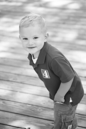
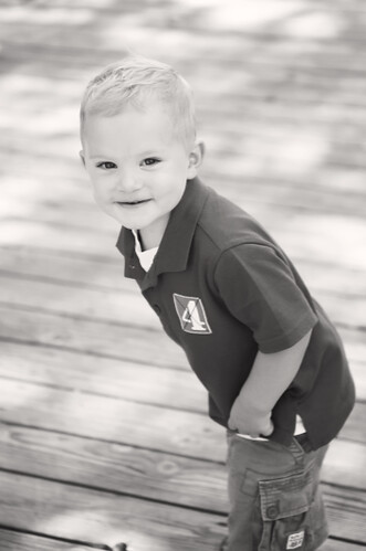
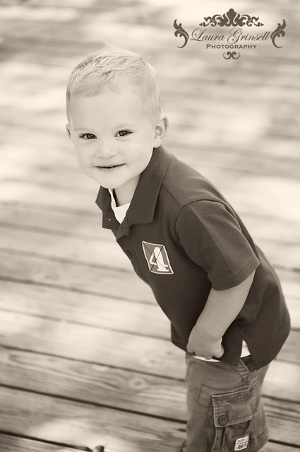
Here is the photo before the conversion:
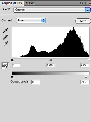
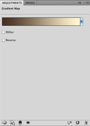
Here is a screen shot I took while editing:
Here is an explanation of the layers from top to bottom with screen shots of the photo step by step:
- First I created a B&W gradient map to make a boring yucky B&W conversion, then made that my background (I always make a snapshot before this)
Now here's what I have:
- Then adjust the RGB levels to make the B&W not so cool
- The first gradient map you see is the same one used to convert to B&W, but I set the layer to screen to brighten it up a little.
- Gradient Map 2 is another plain B&W gradient with the layer set to overlay to give it a little boost. A little goes a long with with most of these layers so I suggest keeping the opacities fairly low.
- Gradient Map 3 gives it that warmer tone and looks like this:
I have this layer set to multiply
- Then I have two different fill layers to give it more of that brownish/aged color the first layer is set to multiply the second layer is set to soft light
- Lastly I create an "s" curve to give it a little pop and adjust the opacities to taste.
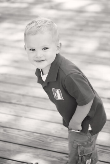
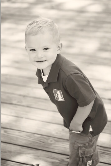
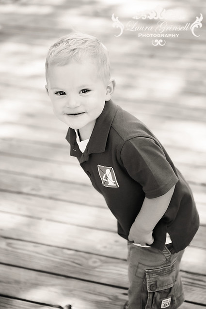
Here is the final photo:
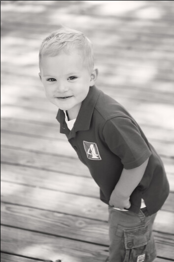
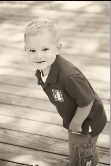
And for a more "traditional" B&W I just deleted the 3rd Gradient Map and the 2nd Color Fill:


2 comments:
Thanks so much! I took a Photoshop course last quarter here but I havent used much! Nice to have some pro tips! have a great weekend!
Great tutorial! Thanks!
Post a Comment